AI prompts
base on This package provides a responsive modal with multiple pages, motion animation for page transitions, and scrollable content within each page. <p align="center">
<a href="https://wolt.com/"><img src="https://img.shields.io/badge/Powered%20by-Wolt-blue.svg" alt="Wolt"></a>
<a href="https://pub.dev/packages/wolt_modal_sheet/publisher"><img src="https://img.shields.io/pub/publisher/wolt_modal_sheet.svg" alt="Wolt on pub.dev"></a>
<br>
<a href="https://pub.dev/packages/wolt_modal_sheet"><img src="https://badgen.net/pub/flutter-platform/wolt_modal_sheet" alt="Platforms"></a>
<br>
<a href="https://pub.dev/packages/wolt_modal_sheet"><img src="https://img.shields.io/pub/v/wolt_modal_sheet?logo=dart&logoColor=white" alt="Pub Version"></a>
<a href="https://pub.dev/packages/wolt_modal_sheet"><img src="https://badgen.net/pub/points/wolt_modal_sheet" alt="Pub points"></a>
<a href="https://pub.dev/packages/wolt_modal_sheet"><img src="https://badgen.net/pub/likes/wolt_modal_sheet" alt="Pub Likes"></a>
<br>
<a href="https://github.com/woltapp/wolt_modal_sheet"><img src="https://img.shields.io/github/stars/woltapp/wolt_modal_sheet?style=social" alt="Repo stars"></a>
<a href="https://github.com/woltapp/wolt_modal_sheet/commits/main"><img src="https://img.shields.io/github/last-commit/woltapp/wolt_modal_sheet/main?logo=git" alt="Last Commit"></a>
<a href="https://github.com/woltapp/wolt_modal_sheet/pulls"><img src="https://img.shields.io/github/issues-pr/woltapp/wolt_modal_sheet" alt="Repo PRs"></a>
<a href="https://github.com/woltapp/wolt_modal_sheet/issues?q=is%3Aissue+is%3Aopen"><img src="https://img.shields.io/github/issues/woltapp/wolt_modal_sheet" alt="Repo issues"></a>
<a href="https://github.com/woltapp/wolt_modal_sheet/graphs/contributors"><img src="https://badgen.net/github/contributors/woltapp/wolt_modal_sheet" alt="Contributors"></a>
<a href="https://github.com/woltapp/wolt_modal_sheet/blob/main/LICENSE"><img src="https://badgen.net/github/license/woltapp/wolt_modal_sheet" alt="License"></a>
<br>
<a href="https://app.codecov.io/gh/woltapp/wolt_modal_sheet"><img src="https://img.shields.io/codecov/c/github/woltapp/wolt_modal_sheet?logo=codecov&logoColor=white" alt="Coverage Status"></a>
</p>
# WoltModalSheet
WoltModalSheet is designed to revolutionize the use of modal sheets in
Flutter apps. Built with Wolt-grade design quality and used extensively
in [Wolt](https://wolt.com/) products, this UI component offers a visually
appealing and highly customizable modal sheets with multiple pages, motion
for page transitions, and scrollable content within each page.
- [Usage](#usage)
* [Basic Starter App](#basic-starter-app)
* [Basic Multi Page Example app](#basic-multi-page-example-app)
* [Playground app with imperative navigation](#playground-app-with-imperative-navigation)
* [Playground app with declarative navigation](#playground-app-with-declarative-navigation)
* [Coffee maker app for state management example](#coffee-maker-app-for-state-management-example)
* [CupertinoApp support](#cupertinoapp-support)
- [Features](#features)
* [Multi-Page Layout](#multi-page-layout)
* [Scrollable Content](#scrollable-content)
* [Responsive Design](#responsive-design)
* [Custom Modal Types](#custom-modal-types)
* [Motion](#motion)
* [Imperative and Declarative Navigation](#imperative-and-declarative-navigation)
* [Dynamic Pagination](#dynamic-pagination)
* [State Management Integration](#state-management-integration)
- [Modal Types](#modal-types)
* [Defining Custom Modal Types](#defining-custom-modal-types)
* [Modal Type Responsiveness](#modal-type-responsiveness)
- [Decorating modal types, modal, and pages](#decorating-modal-types-modal-and-pages)
* [Decoration Approaches](#decoration-approaches)
+ [Modal Type Level Decoration](#modal-type-level-decoration)
+ [Modal Level Decoration](#modal-level-decoration)
* [Types of Decoration](#types-of-decoration)
+ [Page Content Decoration](#page-content-decoration)
+ [Modal Decoration](#modal-decoration)
- [Why use modalDecorator for state management?](#why-use-modaldecorator-for-state-management)
* [Migration to v0.8.0](#migration-to-v080)
- [Usage of WoltModalSheet Pages](#usage-of-woltmodalsheet-pages)
* [SliverWoltModalSheetPage](#sliverwoltmodalsheetpage)
* [WoltModalSheetPage](#woltmodalsheetpage)
* [NonScrollingWoltModalSheetPage](#nonscrollingwoltmodalsheetpage)
- [In-Modal Navigation](#in-modal-navigation)
* [Managing Navigation Stack](#managing-navigation-stack)
+ [Adding Pages to the Stack](#adding-pages-to-the-stack)
+ [Modifying Existing Pages](#modifying-existing-pages)
- [Replace a specific page](#replace-a-specific-page)
- [Replace or update the current page](#replace-or-update-the-current-page)
- [Remove a specific page](#remove-a-specific-page)
- [Add or replace pages](#add-or-replace-pages)
* [Navigation Between Pages](#navigation-between-pages)
+ [Direct navigation](#direct-navigation)
+ [Pushing Pages](#pushing-pages)
+ [Popping Page](#popping-page)
* [Dynamic Navigation with ValueNotifiers](#dynamic-navigation-with-valuenotifiers)
+ [Navigation by Page Index Notifier](#navigation-by-page-index-notifier)
+ [Dynamic Page List Management by Page List Builder Notifier](#dynamic-page-list-management-by-page-list-builder-notifier)
- [Design Guidelines](#design-guidelines)
* [Overview](#overview)
* [Breakpoints](#breakpoints)
* [Modal Types](#modal-types)
+ [Alert Dialog](#alert-dialog)
+ [Dialog](#dialog)
+ [Side Sheet](#side-sheet)
+ [Bottom Sheet](#bottom-sheet)
- [Understanding the page elements](#understanding-the-page-elements)
* [Navigation bar widgets](#navigation-bar-widgets)
* [Top bar and top bar title](#top-bar-and-top-bar-title)
* [Sticky action bar (SAB)](#sticky-action-bar-sab)
* [Hero image](#hero-image)
* [Page Title](#page-title)
* [Main content](#main-content)
- [Designer's Collaboration Guide](#designer-collaboration-guide)
* [What's Inside the Figma File](#what-is-inside-the-figma-file)
- [Customizable Animations](#customizable-animations)
* [Default Animation Style Specifications](#default-animation-style-specifications)
+ [Pagination Animation](#pagination-animation)
+ [Scrolling Animation](#scrolling-animation)
* [Example Configuration](#example-configuration)
- [Additional information](#additional-information)
## Usage
This package includes five example projects, but if you're looking to get a quick feel for it, check out the basic starter app.
> Besides the "Basic Starter App," be sure to clone the related example repository to get a feel for the fully functioning samples.
### Basic Starter App
Install the library to your project by running:
```bash
flutter pub add wolt_modal_sheet
```
Afterwards, if you copy and paste following code to your `main.dart` file and run it, it will help you get started:
```dart
import 'package:flutter/material.dart';
import 'package:wolt_modal_sheet/wolt_modal_sheet.dart';
void main() {
runApp(
const WoltModalSheetApp(),
);
}
class WoltModalSheetApp extends StatelessWidget {
const WoltModalSheetApp({super.key});
@override
Widget build(BuildContext context) {
return const MaterialApp(
home: WoltModalSheetHomePage(),
);
}
}
class WoltModalSheetHomePage extends StatelessWidget {
const WoltModalSheetHomePage({super.key});
@override
Widget build(BuildContext context) {
return Scaffold(
appBar: AppBar(
title: const Text('Wolt Modal Bottom Sheet Sample'),
),
floatingActionButton: FloatingActionButton.extended(
onPressed: () {
WoltModalSheet.show(
context: context,
pageListBuilder: (bottomSheetContext) => [
SliverWoltModalSheetPage(
mainContentSliversBuilder: (context) => [
SliverList.builder(
itemBuilder: (context, index) {
return ListTile(
title: Text('Index is $index'),
onTap: Navigator.of(bottomSheetContext).pop,
);
},
),
],
)
],
);
},
label: const Text('Trigger Wolt Sheet'),
),
);
}
}
```
The code above will show you the screen below:
<img src="https://github.com/woltapp/wolt_modal_sheet/blob/main/doc/basic_app_screenshot.png?raw=true" alt="WoltModalSheet with an endless list of items indicating the index of each item." width="280"/>
### Basic Multi Page Example app
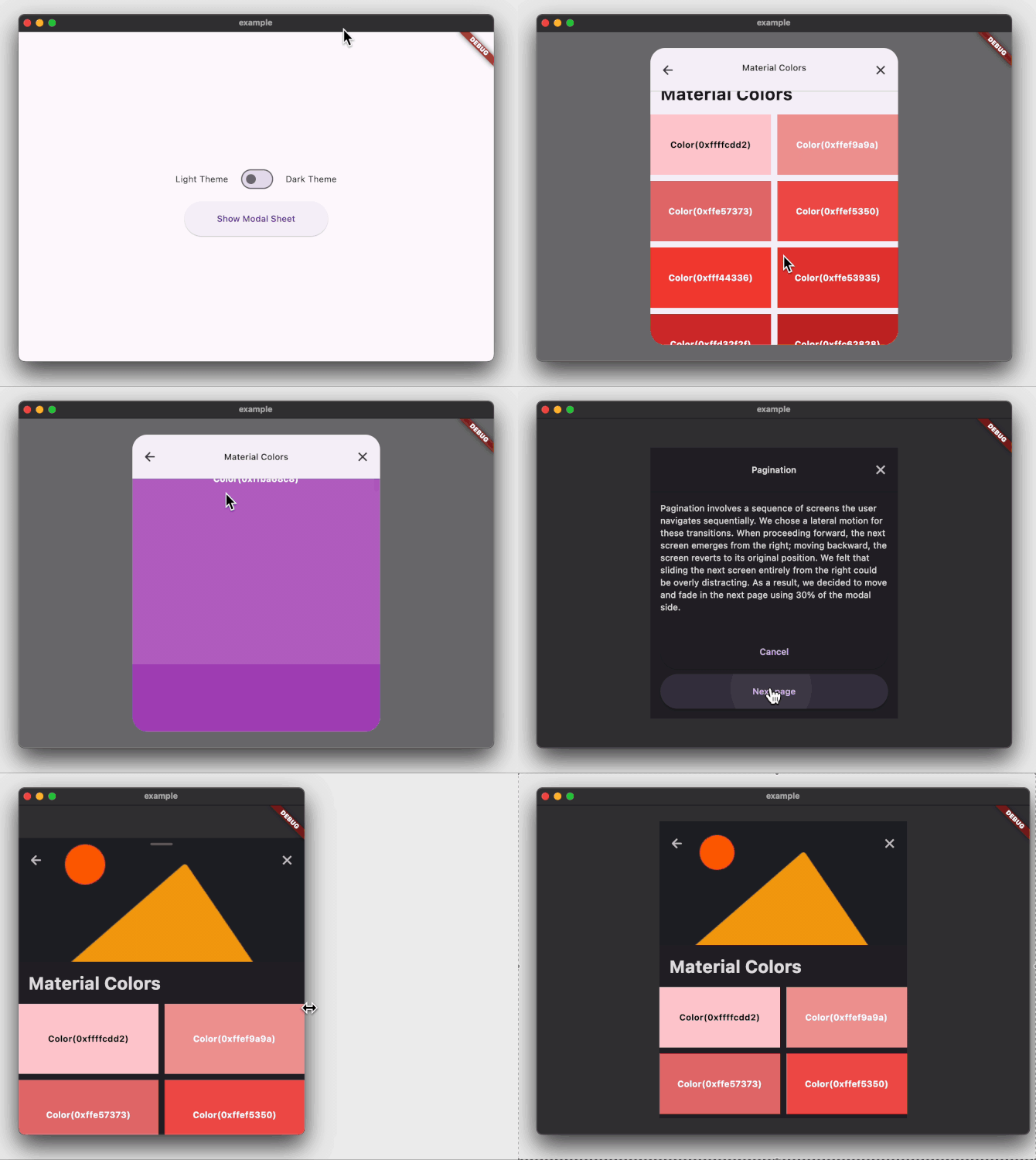
The [example](./example/) app demonstrates how to display a two-pages modal
sheet that can be customized for dark and light themes
using [WoltModalSheetThemeData](./lib/src/theme/wolt_modal_sheet_theme_data.dart) theme
extension.
```dart
@override
Widget build(BuildContext context) {
SliverWoltModalSheetPage page1(BuildContext modalSheetContext, TextTheme textTheme) {
return WoltModalSheetPage(
hasSabGradient: false,
stickyActionBar: Padding(
padding: const EdgeInsets.all(_pagePadding),
child: Column(
children: [
ElevatedButton(
onPressed: Navigator.of(modalSheetContext).pop,
child: const SizedBox(
height: _buttonHeight,
width: double.infinity,
child: Center(child: Text('Cancel')),
),
),
const SizedBox(height: 8),
ElevatedButton(
onPressed: WoltModalSheet.of(modalSheetContext).showNext,
child: const SizedBox(
height: _buttonHeight,
width: double.infinity,
child: Center(child: Text('Next page')),
),
),
],
),
),
topBarTitle: Text('Pagination', style: textTheme.titleSmall),
isTopBarLayerAlwaysVisible: true,
trailingNavBarWidget: IconButton(
padding: const EdgeInsets.all(_pagePadding),
icon: const Icon(Icons.close),
onPressed: Navigator.of(modalSheetContext).pop,
),
child: const Padding(
padding: EdgeInsets.fromLTRB(
_pagePadding,
_pagePadding,
_pagePadding,
_bottomPaddingForButton,
),
child: Text(
'''
Pagination involves a sequence of screens the user navigates sequentially. We chose a lateral motion for these transitions. When proceeding forward, the next screen emerges from the right; moving backward, the screen reverts to its original position. We felt that sliding the next screen entirely from the right could be overly distracting. As a result, we decided to move and fade in the next page using 30% of the modal side.
''',
)),
);
}
SliverWoltModalSheetPage page2(BuildContext modalSheetContext, TextTheme textTheme) {
return SliverWoltModalSheetPage(
pageTitle: Padding(
padding: const EdgeInsets.all(_pagePadding),
child: Text(
'Material Colors',
style: textTheme.headlineMedium!.copyWith(fontWeight: FontWeight.bold),
),
),
heroImage: Image(
image: NetworkImage(
'https://raw.githubusercontent.com/woltapp/wolt_modal_sheet/main/example/lib/assets/images/material_colors_hero${_isLightTheme ? '_light' : '_dark'}.png',
),
fit: BoxFit.cover,
),
leadingNavBarWidget: IconButton(
padding: const EdgeInsets.all(_pagePadding),
icon: const Icon(Icons.arrow_back_rounded),
onPressed: WoltModalSheet.of(modalSheetContext).showPrevious,
),
trailingNavBarWidget: IconButton(
padding: const EdgeInsets.all(_pagePadding),
icon: const Icon(Icons.close),
onPressed: Navigator.of(modalSheetContext).pop,
),
mainContentSliversBuilder: (context) => [
SliverGrid(
gridDelegate: const SliverGridDelegateWithFixedCrossAxisCount(
crossAxisCount: 2,
mainAxisSpacing: 10.0,
crossAxisSpacing: 10.0,
childAspectRatio: 2.0,
),
delegate: SliverChildBuilderDelegate(
(_, index) => ColorTile(color: materialColorsInGrid[index]),
childCount: materialColorsInGrid.length,
),
),
SliverList(
delegate: SliverChildBuilderDelegate(
(_, index) => ColorTile(color: materialColorsInSliverList[index]),
childCount: materialColorsInSliverList.length,
),
),
],
);
}
return MaterialApp(
themeMode: _isLightTheme ? ThemeMode.light : ThemeMode.dark,
theme: ThemeData.light().copyWith(
extensions: const <ThemeExtension>[
WoltModalSheetThemeData(
heroImageHeight: _heroImageHeight,
topBarShadowColor: _lightThemeShadowColor,
modalBarrierColor: Colors.black54,
mainContentScrollPhysics: ClampingScrollPhysics(),
),
],
),
darkTheme: ThemeData.dark().copyWith(
extensions: const <ThemeExtension>[
WoltModalSheetThemeData(
topBarShadowColor: _darkThemeShadowColor,
modalBarrierColor: Colors.white12,
sabGradientColor: _darkSabGradientColor,
mainContentScrollPhysics: ClampingScrollPhysics(),
),
],
),
home: Scaffold(
body: Builder(
builder: (context) {
return Column(
mainAxisAlignment: MainAxisAlignment.center,
children: [
Row(...),
ElevatedButton(
onPressed: () {
WoltModalSheet.show<void>(
context: context,
pageListBuilder: (modalSheetContext) {
final textTheme = Theme.of(context).textTheme;
return [
page1(modalSheetContext, textTheme),
page2(modalSheetContext, textTheme),
];
},
modalTypeBuilder: (context) {
final size = MediaQuery.sizeOf(context).width;
if (size < _pageBreakpoint) {
return WoltModalType.bottomSheet();
} else {
return WoltModalType.dialog();
}
},
onModalDismissedWithBarrierTap: () {
debugPrint('Closed modal sheet with barrier tap');
Navigator.of(context).pop();
},
);
},
child: const SizedBox(
height: _buttonHeight,
width: _buttonWidth,
child: Center(child: Text('Show Modal Sheet')),
),
),
],
);
},
),
),
);
}
```
The example project above will create the following:
</br>
</br>
### Playground app with imperative navigation
The playground app ([source code](https://github.com/woltapp/wolt_modal_sheet/tree/main/examples/playground), [web app](https://playgroundwoltexample.web.app))
demonstrates how to imperatively show the
modal sheet. The purpose of this module is to play and experiment with various
use cases.
### Playground app with declarative navigation
The playground_navigator2 app ([source code](https://github.com/woltapp/wolt_modal_sheet/tree/main/examples/playground_navigator2), [web app](https://playgroundnavigator2woltexample.web.app)) has the similar content with
the [playground](./examples/playground/) app but the modal sheet is shown using
Navigator 2.0 (Router API) in a declarative way.
### Coffee maker app for state management example
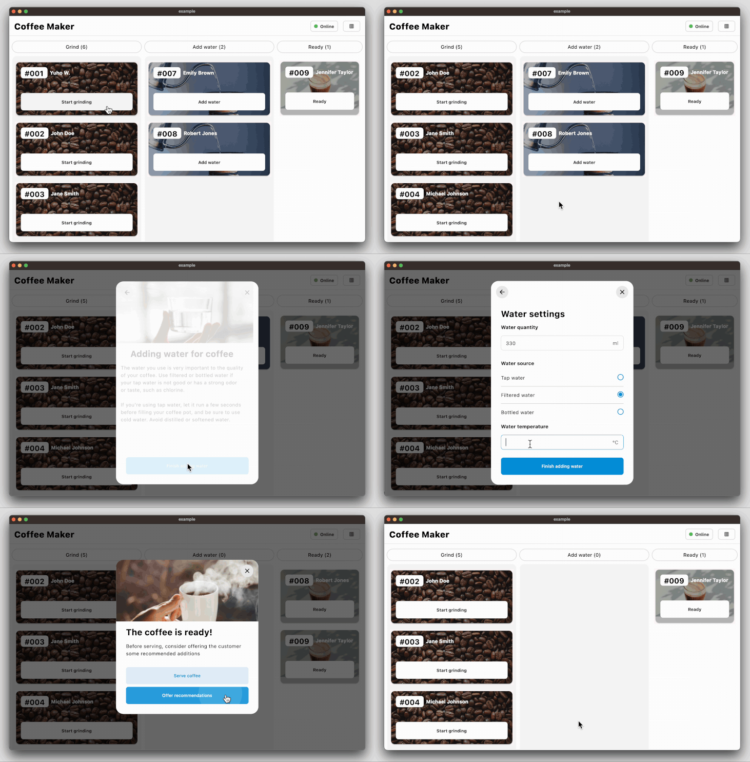
The coffee_maker app ([source code](https://github.com/woltapp/wolt_modal_sheet/tree/main/examples/coffee_maker), [web app](https://coffeemakerexample.web.app)) demonstrates how to manage the state among the page components with an opinionated use of the Provider state
management library.
The following code snippet demonstrates how to decorate the modal sheet with a change
notifier provider so that the page components can be rebuilt according to the
current state:
```dart
void _onCoffeeOrderSelectedInAddWaterState(
BuildContext context, String coffeeOrderId) {
final model = context.read<StoreOnlineViewModel>();
WoltModalSheet.show(
context: context,
pageContentDecorator: (child) {
return ChangeNotifierProvider<StoreOnlineViewModel>.value(
value: model,
builder: (_, __) => child,
);
},
pageListBuilder: (context) {
return [
AddWaterDescriptionModalPage.build(coffeeOrderId),
WaterSettingsModalPage.build(coffeeOrderId)
];
},
modalTypeBuilder: _modalTypeBuilder,
);
}
```
### Coffee maker app with Navigator 2.0
The coffee_maker_navigator2 ([source code](https://github.com/woltapp/wolt_modal_sheet/tree/main/examples/coffee_maker_navigator_2), [web app](https://coffeemakernavigator2.web.app)) app demonstrates how to manage app navigation including the modal sheet with Navigator 2.0 by
applying the MVVM pattern with the Provide state management package.
### CupertinoApp support
In the package, certain Material widgets rely on retrieving Material localizations information
from the widget tree. However, Material localizations are not inherently available in CupertinoApp,
leading to potential errors. To mitigate this issue, if your application utilizes CupertinoApp
rather than MaterialApp, it is needed to incorporate a default Material localization delegate
into your application configuration.
```dart
CupertinoApp(
localizationsDelegates: const <LocalizationsDelegate<dynamic>>[DefaultMaterialLocalizations.delegate],
)
```
To see its usage, please check [coffee maker example app](examples/coffee_maker/lib/main.dart).
## Features
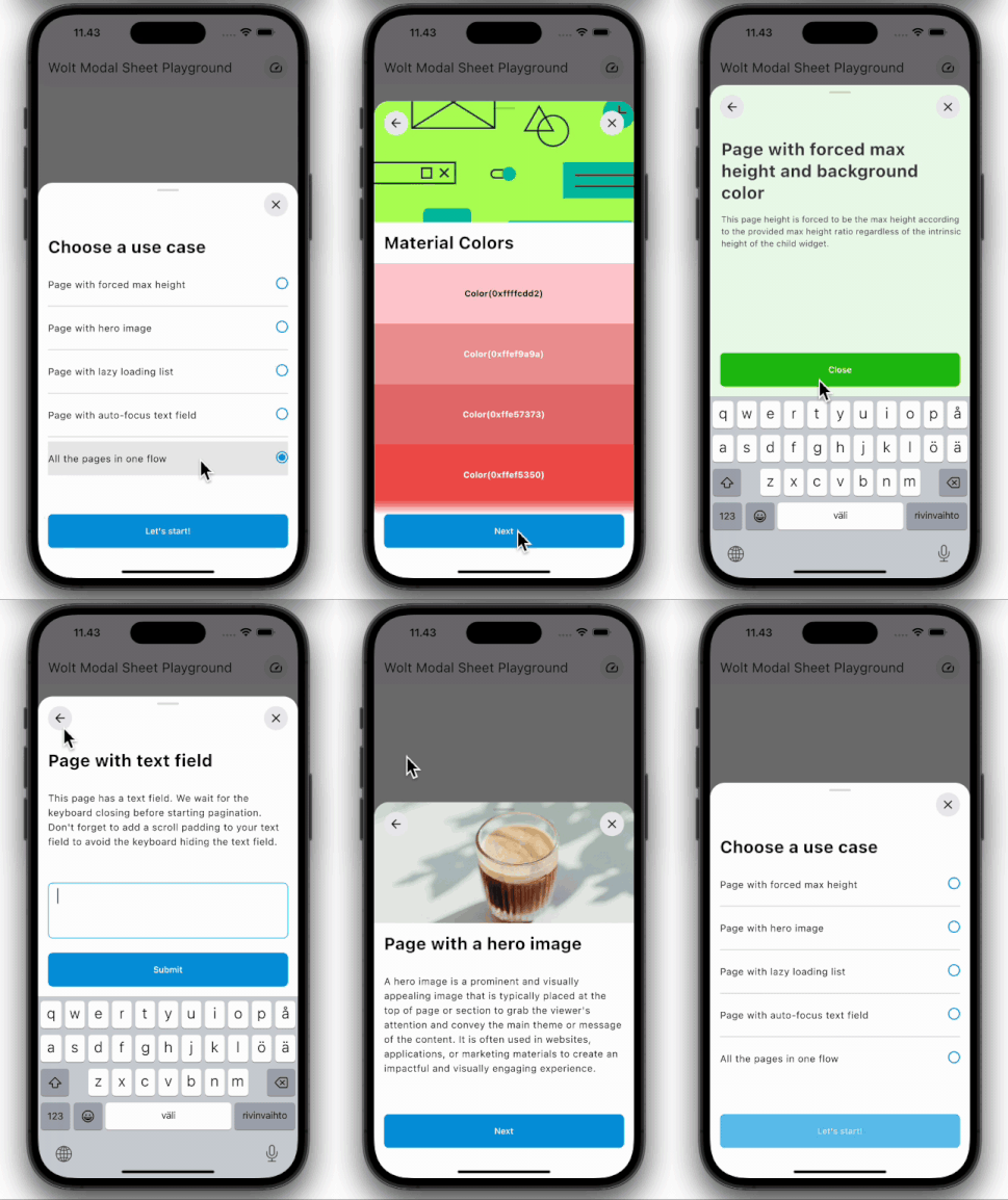
### Multi-Page Layout
Traverse through numerous pages within a single sheet.
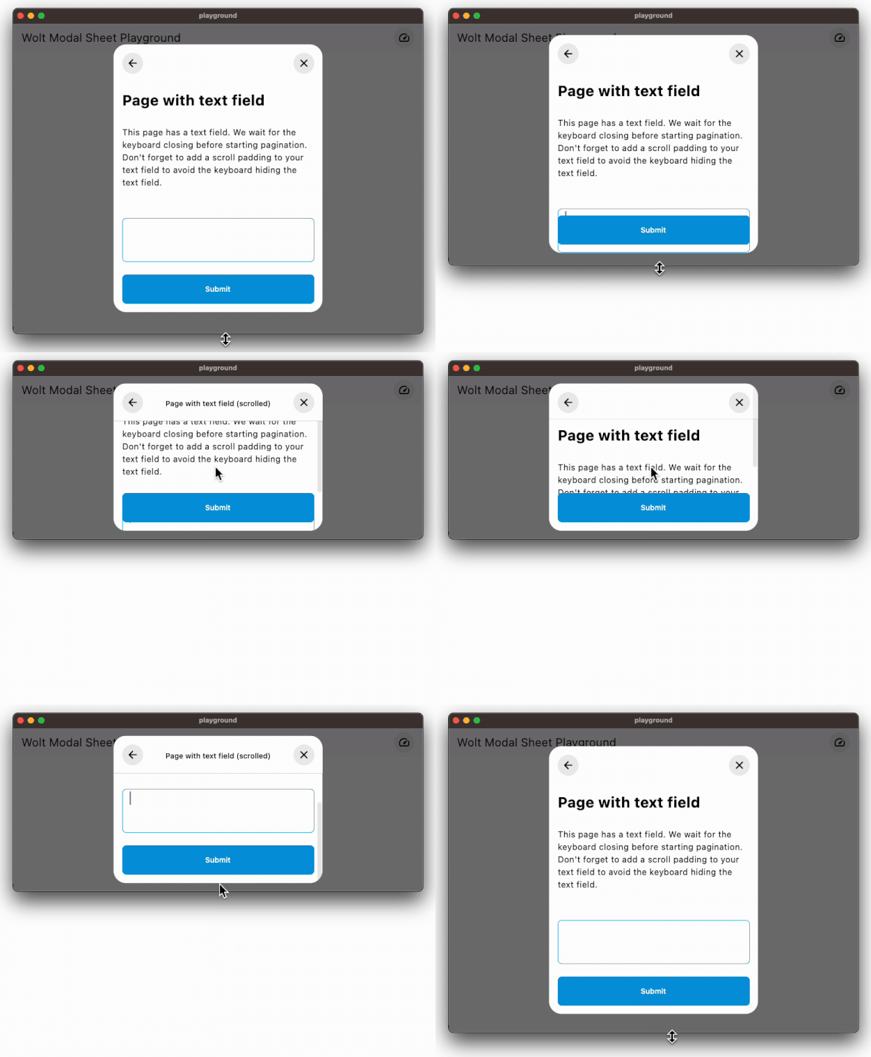
### Scrollable Content
Easily accommodates large content by using scrollable pages.
### Responsive Design
The modal sheet is responsive, appearing as a dialog or side sheet on large
screens and as a bottom sheet on small screens, guided by user-specified
conditions.

### Custom Modal Types
The package offers four customizable modal types: bottom sheet, dialog, side
sheet, and alert dialog. It also supports creating entirely custom modal types.

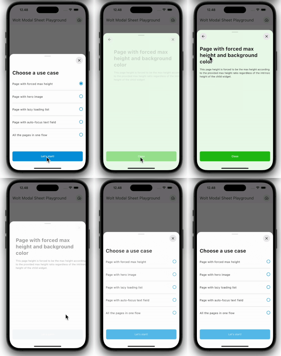
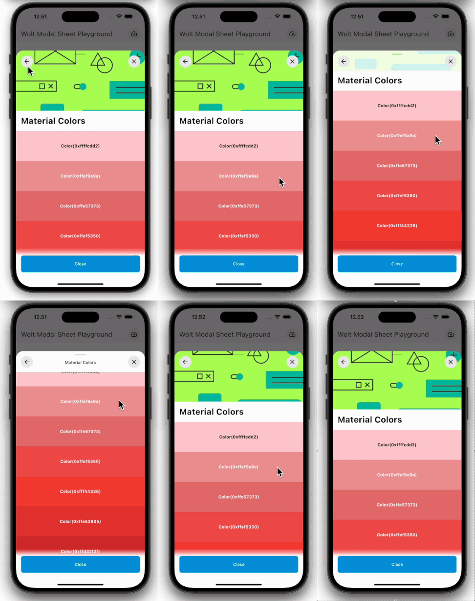
### Motion
Engage users with dynamic motion for page transitions and scrolling.
| Pagination | Scrolling |
| ---------------------------------------------------------------------------------------------------------- | ----------------------------------------------------------------------------------------------------- |
|  |  |
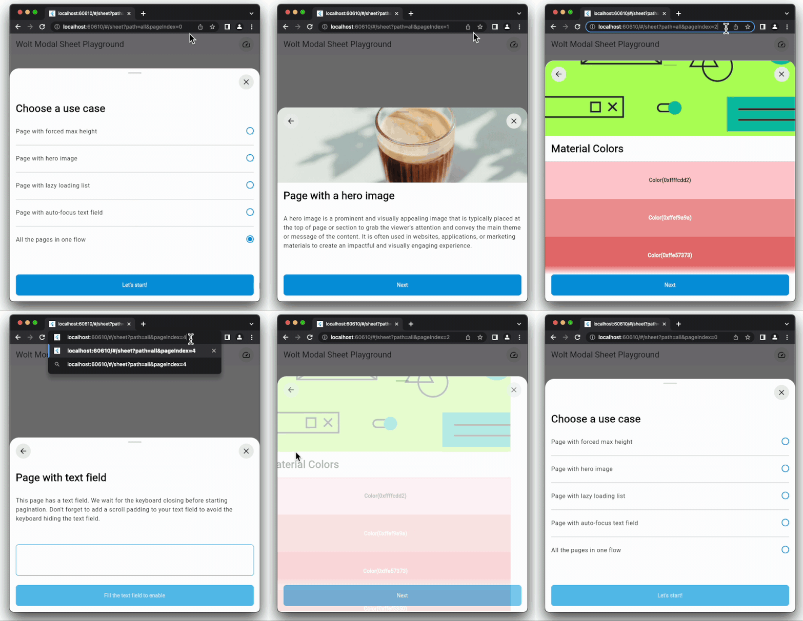
### Imperative and Declarative Navigation
The package showcases examples of both imperative and declarative navigation
patterns to display modal sheet on screen.
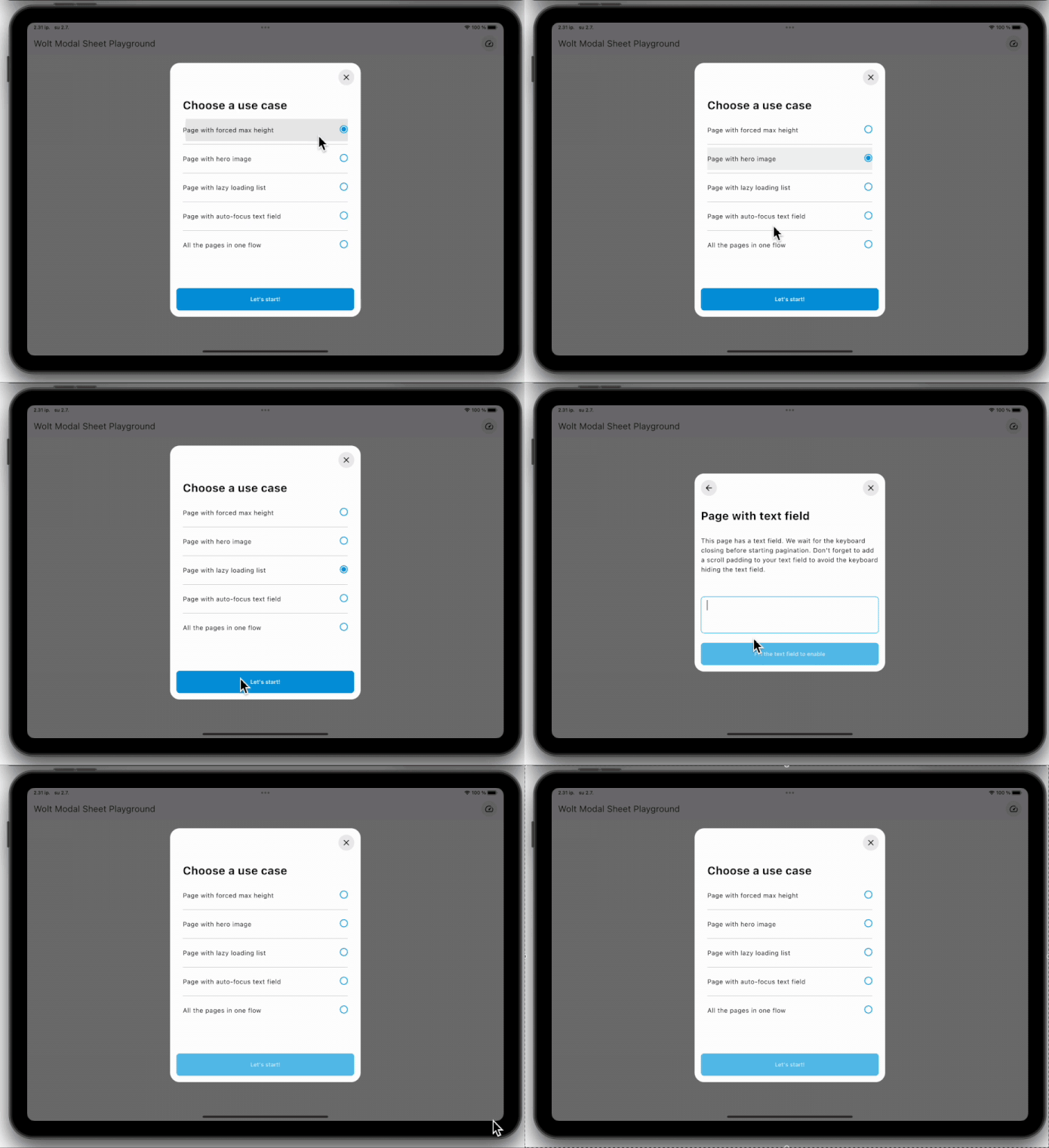
### Dynamic Pagination
User input can dynamically shape the modal sheet's page list.
### State Management Integration
Pages in the Wolt Modal Sheet offer a customizable look. The page components
are provided with an instance of WoltModalSheetPage class. The API provides a
way to manage the state among the page components to be used with popular
libraries such as Bloc and Provider.
</br>
</br>
## Modal Types
The WoltModalSheet package provides four modal types which can be
instantiated as follows:
- Bottom sheet: `WoltBottomSheetType()` or `WoltModalType.bottomSheet()`
- Dialog: `WoltDialogType()` or `WoltModalType.dialog()`
- Side sheet: `WoltSideSheetType()` or `WoltModalType.sideSheet()`
- Alert dialog: `WoltAlertDialogType()` or `WoltModalType.alertDialog()`
These modal types are designed according to the Wolt design system specs and
can be customized to suit your application's design language by extending
these classes. For example:
```dart
class MyCustomBottomSheetType extends WoltBottomSheetType {
const MyCustomBottomSheetType()
: super(
shapeBorder: const RoundedRectangleBorder(borderRadius: BorderRadius.all(Radius.circular(24))),
showDragHandle: false,
barrierDismissible: false,
);
}
```
Alternatively, you can change the modal properties with the `copyWith method:
```dart
WoltModalSheet.show(
context: context,
modalTypeBuilder: (_) => WoltModalType.bottomSheet().copyWith(barrierDismissible: false),
);
```
### Defining Custom Modal Types
Custom modal types can be defined by extending the abstract `WoltModalType`
class. This approach allows you to create modal types that align with your
design language and application requirements.
To define a custom modal type, you need to override the following methods:
- `routeLabel`: Provides an accessibility label for the modal.
- `layoutModal`: Returns the constraints for the modal layout.
- `positionModal`: Returns the offset for the modal position from the
top-left corner of the route screen.
- `buildTransitions`: Allows defining custom animation effects for the modal's
entry and exit.
Additionally, you can override the following properties:
- `shapeBorder`: Defines the shape of the modal.
- `dismissDirection`: Specifies the direction in which the modal can be
dismissed. The dismiss direction can be set to `up`, `down`, `startToEnd`,
or `endToStart`.
- `showDragHandle`: Determines whether the modal displays a drag handle on top.
- `closeProgressThreshold`: Sets the threshold for closing the modal.
- `barrierDismissible`: Determines whether the modal can be dismissed by
tapping outside the modal.
- `enableDrag`: Enables or disables dragging the modal.
- `minFlingVelocity`: Sets the minimum fling velocity required for a drag
gesture to be considered a fling.
- `transitionDuration` and `reverseTransitionDuration`: Specifies the
duration of the modal's entry and exit animations.
- `forceMaxHeight`: Forces the modal content to have a maximum height.
Useful for modal types such as side sheets.
Example:
```dart
class TopNotificationSheetType extends WoltModalType {
final EdgeInsetsDirectional padding;
const TopNotificationSheetType({
this.padding = const EdgeInsetsDirectional.all(32.0),
}) : super(
shapeBorder: const RoundedRectangleBorder(borderRadius: BorderRadius.all(Radius.circular(24))),
dismissDirection: WoltModalDismissDirection.up,
showDragHandle: false,
closeProgressThreshold: 0.8,
barrierDismissible: false,
);
@override
String routeLabel(BuildContext context) {
final MaterialLocalizations localizations = MaterialLocalizations.of(context);
return localizations.dialogLabel;
}
@override
BoxConstraints layoutModal(Size availableSize) {
final availableWidth = availableSize.width;
double width = availableWidth > 523.0 ? 312.0 : availableWidth - padding.end;
return BoxConstraints(
minWidth: width,
maxWidth: width,
minHeight: 0,
maxHeight: availableSize.height * 0.6,
);
}
@override
Offset positionModal(
Size availableSize, Size modalContentSize, TextDirection textDirection) {
final xOffset = max(0.0, (availableSize.width - modalContentSize.width) / 2);
final yOffset = padding.top;
return Offset(xOffset, yOffset);
}
@override
Widget buildTransitions(
BuildContext context,
Animation<double> animation,
Animation<double> secondaryAnimation,
Widget child,
) {
final alphaAnimation = Tween<double>(
begin: 0.0,
end: 1.0,
).animate(CurvedAnimation(
parent: animation,
curve: const Interval(0.0, 100.0 / 300.0, curve: Curves.linear),
reverseCurve: const Interval(100.0 / 250.0, 1.0, curve: Curves.linear),
));
return FadeTransition(
opacity: alphaAnimation,
child: SlideTransition(
position: animation.drive(
Tween(
begin: const Offset(0.0, -1.0),
end: Offset.zero,
).chain(CurveTween(curve: Curves.easeOutQuad)),
),
child: child,
),
);
}
}
```
The above code creates this custom modal type:

### Modal Type Responsiveness
The modal types are designed to be responsive, adapting to different screen
sizes. The modal type's layout, position, and animation can be customized
dynamically based on the available screen size.
```dart
WoltModalSheet.show(
context: context,
modalTypeBuilder: (BuildContext context) {
final width = MediaQuery.sizeOf(context).width;
if (width < 523) {
return WoltModalType.bottomSheet();
} else if (width < 800) {
return WoltModalType.dialog();
} else {
return WoltModalType.sideSheet();
},
...
},
```
The above code snippet produces the following modal types based on the
dynamical screen width:

## Decorating modal types, modal, and pages
WoltModalSheet uses the decorator pattern, which is a structural design
pattern allowing dynamic addition of behavior to individual objects. In
Flutter, this is typically achieved by wrapping widgets with other widgets
to enhance or modify their behavior.
### Decoration Approaches
Decoration can be achieved at both the modal type level and the modal level.
#### Modal Type Level Decoration
The modal type level decoration is applied to all modals of the same type.
To decorate at the modal type level, the corresponding `WoltModalType` class
should be extended and the related methods should be overridden.
Example:
```dart
class MyCustomBottomSheetType extends WoltBottomSheetType {
const MyCustomBottomSheetType() : super();
@override
Widget decoratePageContent(BuildContext context, Widget child, bool useSafeArea) {
return Padding(
padding: const EdgeInsets.all(16.0),
child: child,
);
}
@override
Widget decorateModal(BuildContext context, Widget modal, bool useSafeArea) {
return useSafeArea ? SafeArea(child: modal) : modal;
}
}
```
#### Modal Level Decoration
Decoration at the modal level is applied when using the modal and can be
applied to all modal types when the modal sheet is visible. This is done
through the `pageContentDecorator` and `modalDecorator`.
Example:
```dart
WoltModalSheet.show(
context: context,
pageContentDecorator: (widget) => Align(
alignment: Alignment.bottomCenter,
child: ClipRRect(
..., // Your clipRRect properties
child: BackdropFilter(
..., // Your backdrop filter properties
child: widget,
),
),
),
modalDecorator: (child) {
// Wrap the modal with `ChangeNotifierProvider` to manage the state of
// the entire pages in the modal.
return ChangeNotifierProvider<StoreOnlineViewModel>(
builder: (_, __) => StoreOnlineViewModel(),
child: child,
);
},
pageListBuilder: (context) {
final viewModel = context.read<StoreOnlineViewModel>();
return [
WoltModalSheetPage(
child: FirstPageContent(viewModel.data),
pageTitle: Text('First Page Title'),
// Other properties...
),
WoltModalSheetPage(
child: SecondPageContent(viewModel.data),
pageTitle: Text('Second Page Title'),
// Other properties...
),
];
},
);
```
### Types of Decoration
#### Page Content Decoration
- Purpose: Applies additional decorations to the modal page content only,
excluding the barrier.
- Usage: Useful for modifying or enhancing the appearance and behavior of
the modal content without affecting the surrounding barrier and the
placement of the modal on the screen.
```dart
Widget Function(Widget)? pageContentDecorator;
```
#### Modal Decoration
- Purpose: Applies additional decorations to the entire modal, including the
barrier and the page content.
- Usage: Useful for wrapping the entire modal with a widget that manages the
state of the entire pages.
```dart
Widget Function(Widget)? modalDecorator;
```
##### Why use modalDecorator for state management?
When managing the state across the entire modal, for example by providing a
[ChangeNotifierProvider](https://pub.dev/documentation/provider/latest/provider/ChangeNotifierProvider-class.html) for state management, it is important to wrap the
entire modal rather than just the page content. This ensures that the state
is accessible throughout the entire modal lifecycle and all its components.
### Migration to v0.8.0
Versions before the v0.6.0 release used the `decorator` field to decorate as
`modalDecorator`. In release v0.6.0 and later, the `decorator` field was
used as `pageContentDecorator`. In v0.8.0, the `decorator` field was removed
and replaced with `pageContentDecorator` and `modalDecorator`.
## Usage of WoltModalSheet Pages
The WoltModalSheet library provides three primary classes for constructing
modal sheet pages: `WoltModalSheetPage`, `SliverWoltModalSheetPage`, and
`NonScrollingWoltModalSheetPage`.
### SliverWoltModalSheetPage
`SliverWoltModalSheetPage` is designed for layouts requiring the use of
`Sliver` widgets, such as lists, grids, and other scrollable content within
a modal sheet.
```dart
SliverWoltModalSheetPage(
mainContentSliversBuilder: (context) => [
SliverList(
delegate: SliverChildBuilderDelegate((BuildContext context, int index) {
// Your list items
}),
),
// Other sliver widgets...
],
// Additional page elements like pageTitle, topBarTitle, etc.
)
```
### WoltModalSheetPage
WoltModalSheetPage simplifies the process of creating modal sheet pages
without needing to deal with slivers directly. This class is ideal for
straightforward widgets that don't require the advanced capabilities of
slivers and are not lazily built.
```dart
WoltModalSheetPage(
child: MyCustomContentWidget(),
pageTitle: Text('My Page Title'),
// Other properties...
)
```
### NonScrollingWoltModalSheetPage
`NonScrollingWoltModalSheetPage` is designed to display content which is
flexible in height but unlikely to require scrolling. This class is ideal
for content that adapts to the available vertical space within the modal
sheet's maximum height. The main content can utilize the Flex layout model
of a Column for space management.
```dart
NonScrollingWoltModalSheetPage(
child: MyFlexibleHeightWidget(),
// Additional properties...
)
```
## In-Modal Navigation
The package provides in-modal navigation capabilities, allowing for dynamic
transitions and stack manipulations directly within the modal. This section
details how to utilize these features effectively in your applications.
### Managing Navigation Stack
he following methods facilitate the addition, removal, and modification of
pages within the navigation stack. These functionalities allow you to
dynamically adapt the navigation stack based on user interactions without
disrupting the currently displayed page.
#### Adding Pages to the Stack
You can append one or more pages to the navigation stack. This feature is
particularly useful for preloading pages or preparing navigation paths for
future steps without changing the currently displayed page.
```dart
WoltModalSheet.of(context).addPages([newPage1, newPage2, newPage3]);
WoltModalSheet.of(context).addPage(newPage1);
```
#### Modifying Existing Pages
These methods allow you to replace or remove specific pages within the stack.
If the page being modified is currently visible, appropriate adjustments are
made to ensure seamless navigation.
##### Replace a specific page
When you need to update or change the content of a specific page within the
stack, this method allows you to replace any page by its identifier without
altering the rest of the stack.
```dart
WoltModalSheet.of(context).replacePage(pageId, newPage);
```
##### Replace or update the current page
When the current page needs to be removed from the page list and replaced by
a new page, with a pagination animation at the same position in the list,
use `replaceCurrentPage` method.
```dart
WoltModalSheet.of(context).replaceCurrentPage(newPage);
```
When the overall context or the purpose of the current page is still
relevant, but you need to modify specific attributes of the current page, use
`updateCurrentPage` method.
```dart
WoltModalSheet.of(context).updateCurrentPage((currentPage) {
return currentPage.copyWith(
enableDrag: true,
hasTopBarLayer: false,
// Other updated properties...
);
});
```
##### Remove a specific page
This method enables you to selectively remove a page from the navigation
stack using its identifier. If the page being removed is the currently
displayed page, it will remove the page and adjust the currently displayed page
accordingly. If it is not the current page, it is removed from the stack
without impacting the current view.
```dart
WoltModalSheet.of(context).removePage(pageId);
```
##### Add or replace pages
This method updates the navigation stack by either adding new pages or
replacing all subsequent pages depending on the position of the current page.
If the current page is the last in the stack it simply appends the new pages.
However, if the current page is not the last, it replaces all pages
following it with the new ones. This functionality is particularly useful
for adapting the user's navigation path dynamically based on their
interactions with the currently displayed page or when making adjustments to
previously made decisions.
```dart
WoltModalSheet.of(context).addOrReplacePages([newPage1, newPage2, newPage3]);
WoltModalSheet.of(context).addOrReplacePage(newPage);
```
### Navigation Between Pages
This subsection details the methods for moving within the modal's navigation
stack, allowing users to navigate through pages effectively.
#### Direct navigation
Navigate within the modal stack using specific methods to move directly to a
desired page. You can go to the next or previous page, jump to a page at a
specific index in the page list, navigate to a page by its unique identifier,
or even navigate based on the page type with optional filtering criteria.
```dart
// Move to the next page
bool movedNext = WoltModalSheet.of(context).showNext();
// Move to the previous page
bool movedPrevious = WoltModalSheet.of(context).showPrevious();
// Jump directly to a page at a specific index
bool navigatedByIndex = WoltModalSheet.of(context).showAtIndex(2);
// Navigate to a page by its unique identifier
bool navigatedById = WoltModalSheet.of(context).showPageWithId(pageId);
// Navigate to a page by its type
bool didShowPage = WoltModalSheet.of(context).showPage<MyCustomPage>();
// Navigate to a page of a certain type that meets additional criteria
bool didShowFilteredPage = WoltModalSheet.of(context).showPage<MyCustomPage>(
where: (page) => page.someProperty == "desiredValue",
);
```
#### Pushing Pages
Using push methods, you can add one or more new pages to the end of the
navigation stack and navigate to the first of the newly added pages.
```dart
WoltModalSheet.of(context).pushPages([newPage1, newPage2, newPage3]);
WoltModalSheet.of(context).pushPage(newPage);
```
#### Popping Page
Using pop method, you can remove the last page of the navigation stack. If the
user is on the last page, the method will navigate to the previous page.
```dart
bool popped = WoltModalSheet.of(context).popPage();
```
### Dynamic Navigation with ValueNotifiers
`ValueNotifier<int> pageIndexNotifier` and
`ValueNotifier<WoltModalSheetPageListBuilder> pageListBuilderNotifier` can
also be utilized for in-modal navigation and setting the modal navigation
stack. These notifiers dynamically manage the visible page index
and the page list, enhancing flexibility in response to the state changes.
#### Navigation by Page Index Notifier
`ValueNotifier<int> pageIndexNotifier` controls the visible page index,
enabling transitions between pages based on user interactions or other events.
```dart
// Example of setting up a modal with navigation between pages controlled by
// a ValueNotifier<int>.
final pageIndexNotifier = ValueNotifier(0); // Initializes the page index
WoltModalSheet.show(
context: context,
pageListBuilder: (modalSheetContext) => [
PageOne(onNextButtonPressed: () => pageIndexNotifier.value = 1),
PageTwo(onBackButtonPressed: () => pageIndexNotifier.value = pageIndexNotifier.value - 1),
],
pageIndexNotifier: pageIndexNotifier, // Tracks and updates the displayed page
);
```
#### Dynamic Page List Management by Page List Builder Notifier
`ValueNotifier<WoltModalSheetPageListBuilder> pageListBuilderNotifier`
manages updates to the modal's page list based on user interactions or other
app state changes. This is useful when implementing Navigator 2.0 for
declarative navigation scenarios. It is not suggested to mix the usage of
this notifier with the imperative navigation methods provided by the package.
```dart
final pageIndexNotifier = ValueNotifier(0); // Initializes the page index
final pageListBuilderNotifier = ValueNotifier((context) => [
PageOne(onNextButtonPressed: () => pageIndexNotifier.value++),
PageTwo(onBackButtonPressed: () => pageIndexNotifier.value--),
]);
WoltModalSheet.showWithDynamicPath(
context: context,
pageListBuilderNotifier: pageListBuilderNotifier,
pageIndexNotifier: pageIndexNotifier, // Dynamically updates the navigation stack
);
```
## Design Guidelines
This section outlines the design guidelines for the modal sheet component, including breakpoints and behavior across different devices. The guidelines are based on the Wolt design system specs.
### Overview
The modal sheet component is used to display critical information or interactive elements to users in a non-intrusive way. This component adapts to different screen sizes and orientations.
### Breakpoints
The modal sheet component adjusts its layout and positioning based on the
following breakpoints:
- **Breakpoint Large**: Width ≥ 1400px
- **Breakpoint Medium**: 768px ≤ Width < 1400px
- **Breakpoint Small**: 524px ≤ Width < 768px
- **Breakpoint XSmall**: Width < 524px

### Modal Types
#### Alert Dialog
- Used for critical information that requires immediate attention.
- Must be dismissed by user interaction to ensure the alert is acknowledged.
#### Dialog
- Used for single user actions or to convey information related to changes in state (success, errors).
- Provides clear actions for users to acknowledge or dismiss the dialog.
- We recommend to use dialogs in small, medium and large windows sizes.
#### Side Sheet
- Used to focus users' attention on a specific task while keeping the context visible.
- We recommend to use side sheets in small, medium and large windows sizes.
#### Bottom Sheet
- Provides additional options or actions without leaving the current context.
- We recommend to use bottom sheets only in xsmall window size. The side
sheet and dialog content should be shown in a bottom sheet in xsmall window.
## Understanding the page elements
Each element within the WoltModalSheet has a role to play, offering context,
navigational assistance, and explicit action prompts to the user. By
understanding these elements and their roles, you can fully harness the power of
WoltModalSheet and create an intuitive and engaging user experience.
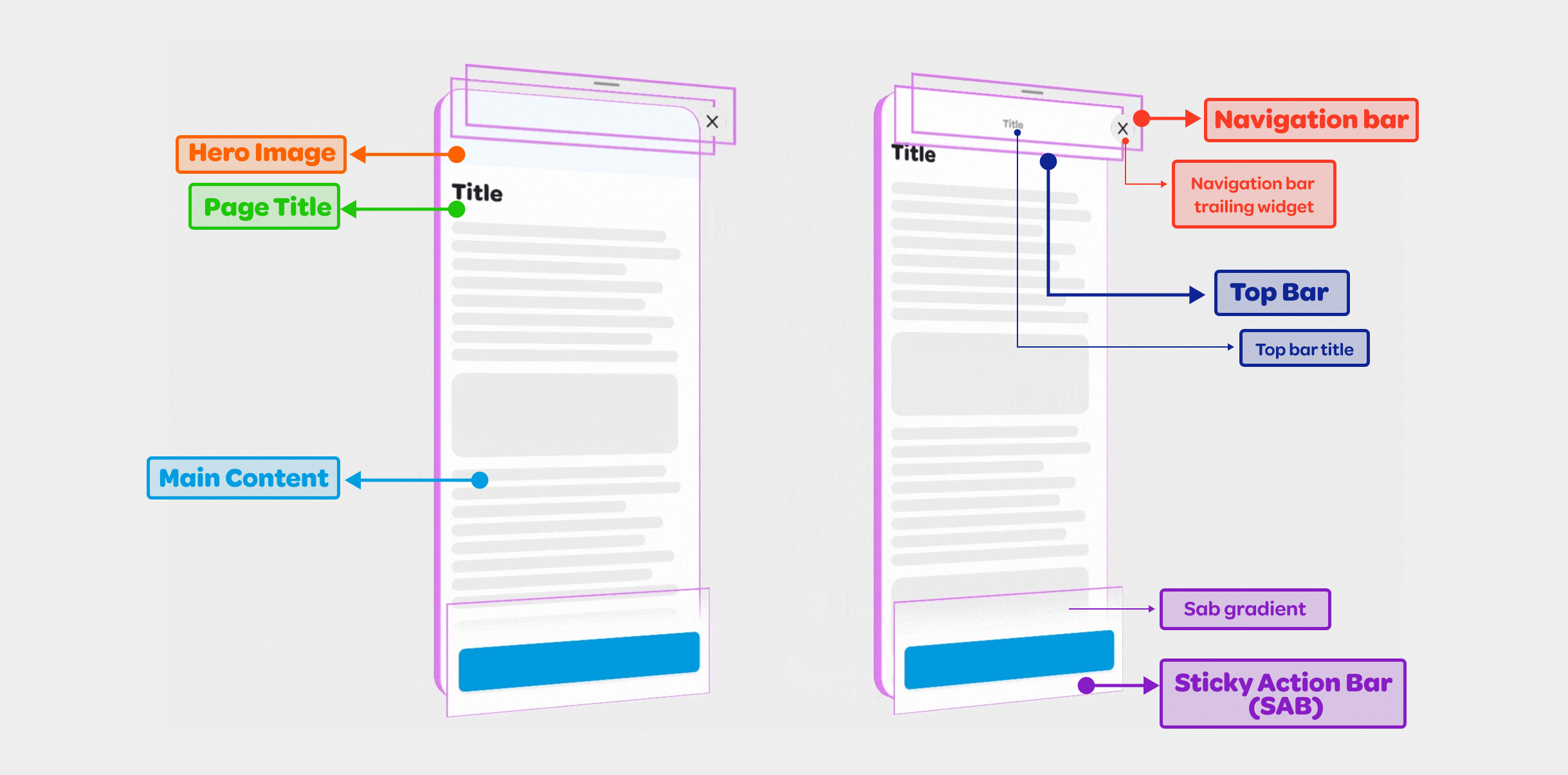
The structure is organized across layers on the z-axis:
<li><b>Main Content Layer</b>: The fundamental content of the page,
including the optional page title, optional hero image, and the main content,
which may be scrollable.</li>
<li><b>Top Bar Layer</b>: Further above the main content layer, this layer
with the filled color includes the top bar title and may become hidden or
sticky based on scroll position and specific properties.</li>
<li><b>Navigation Bar Layer</b>: Sitting at the top of the top bar layer on
z-axis, this transparent-background layer contains navigational widgets for
the interface, such as back or close buttons.</li>
<li><b>Sticky Action Bar Layer</b>: Positioned at the top of the z axis,
this layer guides the user towards the next step, uses an optional gentle
gradient on top to hint that there is more content below ready for scrolling.</li>
</br>
</br>
By employing these various layers, you can create an interactive and visually
appealing interface that resonates with users. Each layer contributes to the
overall coherence of the page, serving a specific purpose and enhancing the
overall user experience.
</br>
### Navigation bar widgets
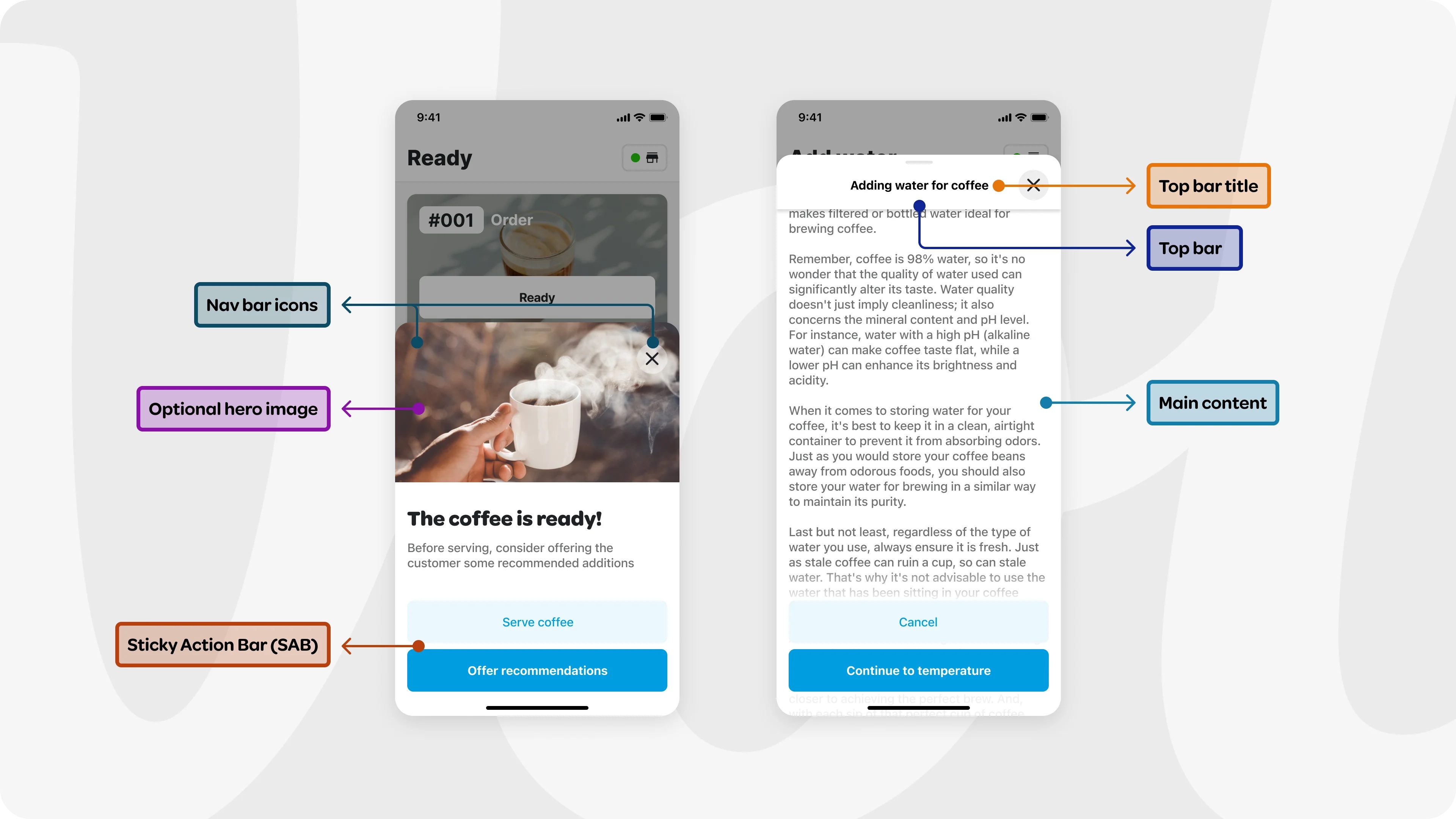
The navigation bar has a transparent background, and resides at the top of
the sheet, situated directly above the top bar on the z-axis. It includes
two specific widgets: the leading and the trailing. The leading widget
usually functions as the back button, enabling users to navigate to the
previous page. The trailing widget often serves as the close button, utilized to
close the modal sheet. The middle area is reserved and left empty for the
visibility of the top bar title.
</br>
</br>
The navigation bar widgets provide clear and intuitive navigational control,
differentiating themselves from the top bar by focusing specifically on
directional navigation within the interface.
### Top bar and top bar title
The top bar layer sits above the main content layer and below the navigation
bar layer in z axis. It helps users grasping the context by displaying an
optional title. In scenarios where the sheet is filled with content
requiring scrolling, the top bar becomes visible as the user scrolls, and
replaces the page title. At this point, the top bar adopts a 'sticky'
position at the top, guaranteeing consistent visibility.
</br>
</br>
The top bar widget has a flexible design. When `hasTopBarLayer` is set to
false, the top bar and the top bar title will not be shown. If
`isTopBarLayerAlwaysVisible` set to true, the top bar will be always visible
regardless of the scroll position.
</br>
</br>
A custom top bar widget can be provided using the `topBar` field. In this
case, the `topBarTitle` field will be ignored, and will not be displayed.
</br>
</br>
The navigation bar widgets overlay above the top bar, and when the default
top bar widget is used in the page, the top bar title is symmetrically
framed between the leading and trailing navigation bar widgets.
### Sticky action bar (SAB)
The Sticky Action Bar (SAB) guides the user towards the next step. Anchored to
the bottom of the view, the SAB elevates above the content with an optional
gentle gradient. This position guarantees that the action remains visible, subtly
hinting to the user that there is more content to be explored below the fold
by scrolling.
### Hero image
An optional Hero Image can be positioned at the top of the main content. This
element immediately grabs the user's attention, effectively conveying the
primary theme or message of the content.
### Page Title
An optional page title above the main content provides users with a quick
understanding of what to expect from the page. As the user scrolls, this title
becomes hidden, at which point the top bar title continues to serve this
context-providing purpose.
### Main content
The main content delivers information according to the user need. It can be
scrollable to handle larger content. The content is built lazily to improve the
performance.
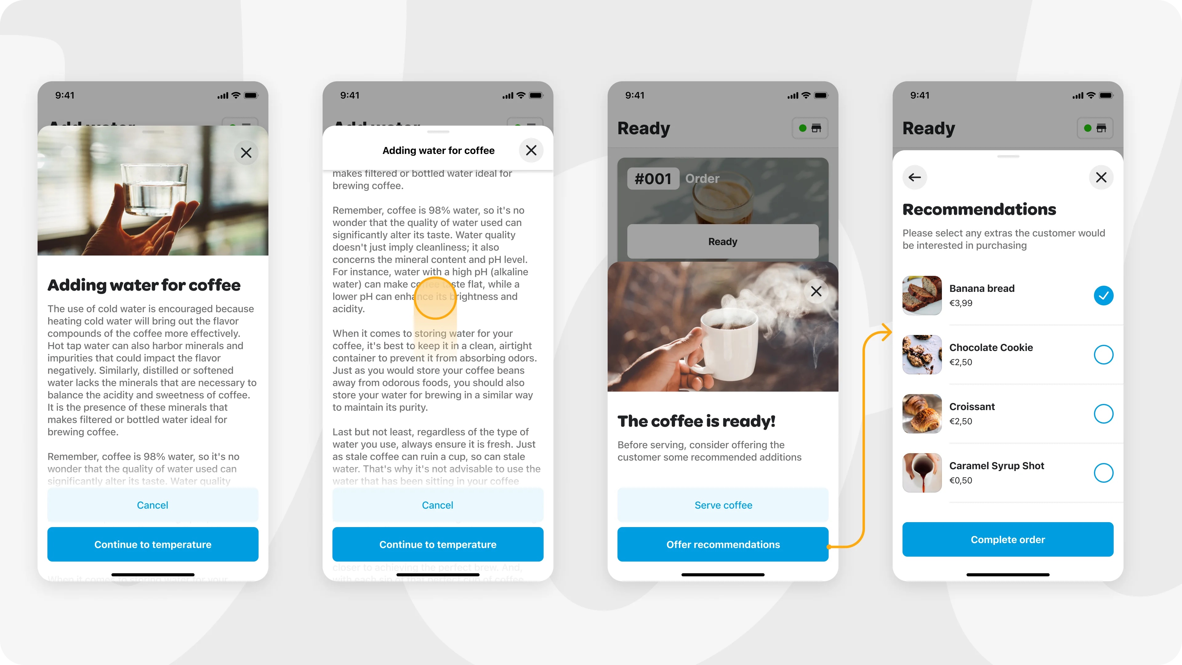
Here is an example that shows all the modal sheet elements in use:
## Designer Collaboration Guide
To ensure seamless collaboration between designers and developers, we have
provided a [Figma file](https://www.figma.com/file/jRQUhvi44bkUxRxSWGhSXO/Wolt-Modal-Sheet-Specs?type=design&node-id=7%3A514&mode=design&t=NULXGTxl2YvnawyH-1) dedicated to the WoltModalSheet package. This resource aims to guide designers through the process of creating and handing over designs that leverage the WoltModalSheet's capabilities effectively.
### What is inside the Figma File
- **Example Design Specifications**: Detailed design guidelines and
specifications mirroring those used internally at Wolt. These specs
illustrate how to prepare designs for development handoff, ensuring a
smooth transition from design to implementation.
- **Modal Types Specifications**: This section showcases specifications for
different modal types, including dialog, alert dialog, side sheet, bottom
sheet modals. It covers essential details like dimensions, layout of
elements, and visual arrangements, providing clear instructions for
replicating these styles in your projects.
- **Motion Specs for Modal Interactions**: To complement the
static design aspects, this section demonstrates motion
specifications for pagination and scrolling interactions. It includes
guidelines for animating transitions between modal sheet pages and within
the content scroll, enabling designers to specify dynamic, engaging user
experiences.
## Customizable Animations
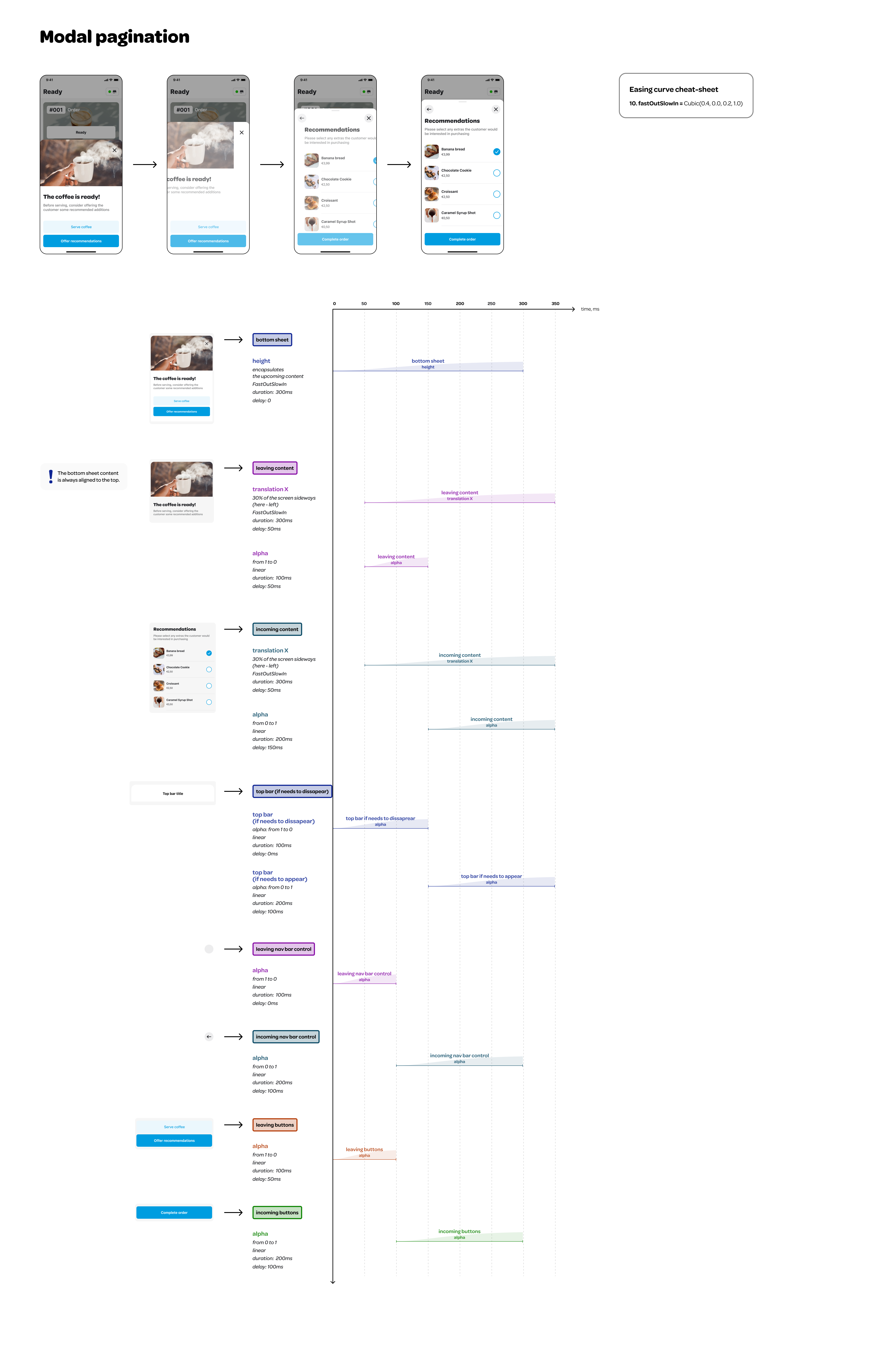
Developers can customize the page scrolling and pagination animations by
providing an instance of `WoltModalSheetAnimationStyle` class to
`WoltModalSheetThemeData`.
### Default Animation Style Specifications
#### Pagination Animation
#### Scrolling Animation
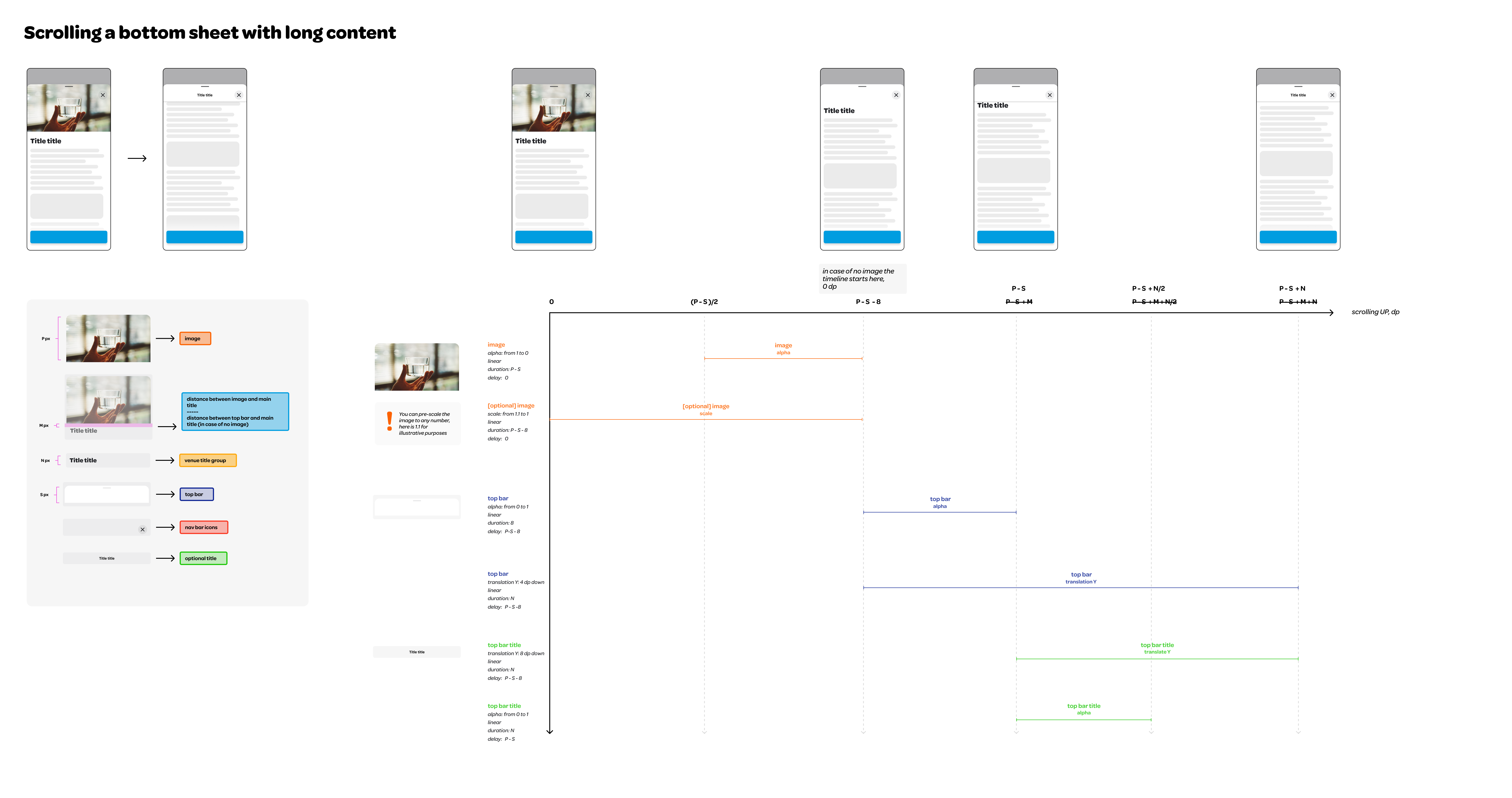
### Example Configuration
```dart
WoltModalSheetThemeData(
animationStyle: WoltModalSheetAnimationStyle(
paginationAnimationStyle: WoltModalSheetPaginationAnimationStyle(
paginationDuration = Duration(milliseconds: 250),
mainContentIncomingOpacityCurve: const Interval(
150 / 350,
350 / 350,
curve: Curves.linear,
),
modalSheetHeightTransitionCurve: const Interval(
0 / 350,
300 / 350,
curve: Curves.fastOutSlowIn,
),
incomingSabOpacityCurve: const Interval(
100 / 350,
300 / 350,
curve: Curves.linear,
),
// Define additional pagination animation styles as needed.
),
scrollAnimationStyle: WoltModalSheetScrollAnimationStyle(
heroImageScaleStart: 1.0,
heroImageScaleEnd: 0.9,
topBarTitleTranslationYInPixels: 8.0,
topBarTranslationYInPixels: 4.0,
// Define additional scroll animation styles as needed.
),
),
),
```
## Additional information
* <b>Design Philosophy</b>: Dive into the creative thought process behind
WoltModalSheet's functionality [in our blog post](https://careers.wolt.com/en/blog/engineering/an-overview-of-the-multi-page-scrollable-bottom-sheet-ui-design)
. Explore how we tackled the design challenges to create an intuitive and
responsive experience.
* <b>Insights from FlutterCon'23
talk</b>: We delved into both the design and developmental facets of this
package at the FlutterCon'23 conference. Catch the
enlightening [recording of his talk](https://www.droidcon.com/2023/08/07/the-art-of-responsive-modals-building-a-multi-page-sheet-in-flutter/)
to understand the nuances.
* <b>Flutter&Friends talk</b>: This is a lightening talk given at the
Flutter&Friends conference on September'23. It covers the design
guidelines and best practices by showing real-world examples highlighting
what to do—and what not to do. It also covers the technical details of the
implementation. The recording of the talk can be found [here](https://www.youtube.com/live/X3bw1pr1kyQ?si=1SielcIbW6rF-4IC&t=4449).
", Assign "at most 3 tags" to the expected json: {"id":"10698","tags":[]} "only from the tags list I provide: [{"id":77,"name":"3d"},{"id":89,"name":"agent"},{"id":17,"name":"ai"},{"id":54,"name":"algorithm"},{"id":24,"name":"api"},{"id":44,"name":"authentication"},{"id":3,"name":"aws"},{"id":27,"name":"backend"},{"id":60,"name":"benchmark"},{"id":72,"name":"best-practices"},{"id":39,"name":"bitcoin"},{"id":37,"name":"blockchain"},{"id":1,"name":"blog"},{"id":45,"name":"bundler"},{"id":58,"name":"cache"},{"id":21,"name":"chat"},{"id":49,"name":"cicd"},{"id":4,"name":"cli"},{"id":64,"name":"cloud-native"},{"id":48,"name":"cms"},{"id":61,"name":"compiler"},{"id":68,"name":"containerization"},{"id":92,"name":"crm"},{"id":34,"name":"data"},{"id":47,"name":"database"},{"id":8,"name":"declarative-gui "},{"id":9,"name":"deploy-tool"},{"id":53,"name":"desktop-app"},{"id":6,"name":"dev-exp-lib"},{"id":59,"name":"dev-tool"},{"id":13,"name":"ecommerce"},{"id":26,"name":"editor"},{"id":66,"name":"emulator"},{"id":62,"name":"filesystem"},{"id":80,"name":"finance"},{"id":15,"name":"firmware"},{"id":73,"name":"for-fun"},{"id":2,"name":"framework"},{"id":11,"name":"frontend"},{"id":22,"name":"game"},{"id":81,"name":"game-engine "},{"id":23,"name":"graphql"},{"id":84,"name":"gui"},{"id":91,"name":"http"},{"id":5,"name":"http-client"},{"id":51,"name":"iac"},{"id":30,"name":"ide"},{"id":78,"name":"iot"},{"id":40,"name":"json"},{"id":83,"name":"julian"},{"id":38,"name":"k8s"},{"id":31,"name":"language"},{"id":10,"name":"learning-resource"},{"id":33,"name":"lib"},{"id":41,"name":"linter"},{"id":28,"name":"lms"},{"id":16,"name":"logging"},{"id":76,"name":"low-code"},{"id":90,"name":"message-queue"},{"id":42,"name":"mobile-app"},{"id":18,"name":"monitoring"},{"id":36,"name":"networking"},{"id":7,"name":"node-version"},{"id":55,"name":"nosql"},{"id":57,"name":"observability"},{"id":46,"name":"orm"},{"id":52,"name":"os"},{"id":14,"name":"parser"},{"id":74,"name":"react"},{"id":82,"name":"real-time"},{"id":56,"name":"robot"},{"id":65,"name":"runtime"},{"id":32,"name":"sdk"},{"id":71,"name":"search"},{"id":63,"name":"secrets"},{"id":25,"name":"security"},{"id":85,"name":"server"},{"id":86,"name":"serverless"},{"id":70,"name":"storage"},{"id":75,"name":"system-design"},{"id":79,"name":"terminal"},{"id":29,"name":"testing"},{"id":12,"name":"ui"},{"id":50,"name":"ux"},{"id":88,"name":"video"},{"id":20,"name":"web-app"},{"id":35,"name":"web-server"},{"id":43,"name":"webassembly"},{"id":69,"name":"workflow"},{"id":87,"name":"yaml"}]" returns me the "expected json"