AI prompts
base on Material Design icons for VS Code <!-- markdownlint-disable -->
<p align="center">
<img src="https://raw.githubusercontent.com/PKief/vscode-material-icon-theme/main/logo.png" alt="logo" width="120">
</p>
<h1 align="center">Material Icon Theme</h1>
<p align="center"><em>Material Design icons for Visual Studio Code</em></p>
<p align="center">
<a href="https://marketplace.visualstudio.com/items?itemName=PKief.material-icon-theme"><img src="https://img.shields.io/npm/v/material-icon-theme?style=for-the-badge&colorA=263238&colorB=4CAF50&label=VERSION" alt="NPM Version"></a>
<a href="https://marketplace.visualstudio.com/items?itemName=PKief.material-icon-theme"><img src="https://img.shields.io/badge/Rating-4.9%2F5-43A047?style=for-the-badge&colorA=263238&colorB=43A047" alt="Rating"></a>
<a href="https://marketplace.visualstudio.com/items?itemName=PKief.material-icon-theme"><img src="https://img.shields.io/badge/Installations-%3E30M-43A047?style=for-the-badge&colorA=263238&colorB=43A047" alt="Installations"></a>
</p>
<br />
<p align="center">Enjoying Material Icon Theme? Support the project by starring it or becoming a sponsor!</p>
<p align="center">
<a href="https://github.com/sponsors/material-extensions"><img src="https://img.shields.io/badge/Sponsor-GitHub-blue?logo=github-sponsors&style=for-the-badge&colorA=263238&colorB=EC407A" alt="Sponsor on GitHub"></a>
<a href="https://github.com/material-extensions/vscode-material-icon-theme"><img src="https://img.shields.io/github/stars/material-extensions/vscode-material-icon-theme?style=for-the-badge&label=Star%20on%20GitHub&colorA=263238&colorB=1976D2" alt="Star on GitHub"></a>
</p>
<br />
### File icons
<details><summary>🏞️ <b>Show all available file icons</b></summary><br/><img src="https://raw.githubusercontent.com/material-extensions/vscode-material-icon-theme/main/images/fileIcons.png" alt="file icons"></details>
### Folder icons
<details><summary>🏞️ <b>Show all available folder icons</b></summary><br/><img src="https://raw.githubusercontent.com/material-extensions/vscode-material-icon-theme/main/images/folderIcons.png" alt="folder icons"></details>
<br />
## Table of Contents
- [Features](#features)
- [Getting Started](#getting-started)
- [Customization](#customization)
- [Commands](#commands)
- [Icon sources](#icon-sources)
- [Contributors](#contributors)
- [Contributing](#contributing)
- [Related extensions](#related-extensions)
## Features
- Material Design file & folder icons for VS Code
- Customizable colors, opacity, and saturation
- Icon packs and theme support
- Custom icon associations and clones
- Easy to use, modern, and actively maintained
## Getting Started
1. **Install the extension**<br>
[](https://marketplace.visualstudio.com/items?itemName=PKief.material-icon-theme)
2. **Activate the icon theme**<br>
Open the command palette (`Ctrl+Shift+P` or `Cmd+Shift+P` on macOS), type `Material Icons: Activate Icon Theme`, and select it.
3. **Enjoy your new icons**<br>
Your editor will now display beautiful, customizable Material Design icons for files and folders.
## Customization
You can personalize the appearance of Material Icon Theme by adjusting colors, icon styles, opacity, and more to match your preferences or workflow.
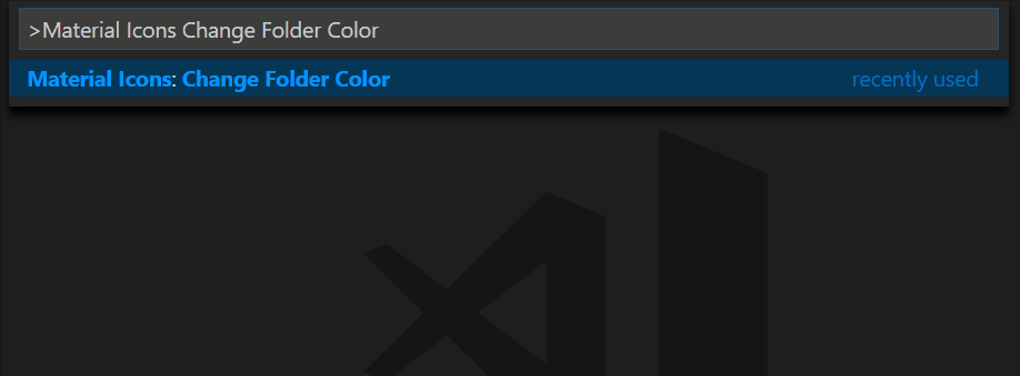
### Customize file & folder color
You can change the color of the default file and folder icons using the command palette:
or via user settings:
```json
"material-icon-theme.folders.color": "#ef5350",
"material-icon-theme.files.color": "#42a5f5",
```
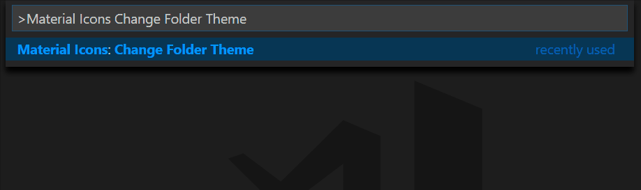
### Folder themes
You can change the design of the folder icons using the command palette:
or via user settings:
```json
"material-icon-theme.folders.theme": "specific"
```
### Custom icon opacity
You can set a custom opacity for the icons:
```json
"material-icon-theme.opacity": 0.5
```
### Custom icon saturation
If colors do not make you happy you can change the icons to have less saturation making them look grayish or completely grayscale by setting saturation to 0:
```json
"material-icon-theme.saturation": 0.5
```
You can also achieve no saturation (i.e., grayscale) by setting **Toggle Grayscale** to ON.
### Custom icon associations
You can customize the icon associations directly in the user settings.
#### File associations
With the `*.[extension]` pattern you can define custom file icon associations. For example you could define an icon for `*.sample` and every file that ends with `.sample` will have the defined icon. However, not all files with the same file extension always have the same icon. For some specific file names there is a special icon. In order to overwrite all the specific file icons as well, two asterisks must be set instead of one, i.e. `**.[extension]`.
If there's no leading `*` it will be automatically configured as filename and not as file extension.
```json
"material-icon-theme.files.associations": {
"*.ts": "typescript",
"**.json": "json",
"fileName.ts": "angular"
}
```
#### Custom SVG icons
It's possible to add custom icons by adding a path to an SVG file which is located relative to the extension's dist folder. However, the restriction applies that the directory in which the custom icons are located must be within the `extensions` directory of the `.vscode` folder in the user directory.
For example a custom SVG file called `sample.svg` can be placed in an `icons` folder inside of VS Code's `extensions` folder:
```text
.vscode
┗ extensions
┗ icons
┗ sample.svg
```
In the settings.json (User Settings only!) the icon can be associated to a file name or file extension like this:
```json
"material-icon-theme.files.associations": {
"fileName.ts": "../../icons/sample"
}
```
_Note: The custom file name must be configured in the settings without the file ending `.svg` as shown in the example above._
#### Custom file icon clones
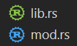
It's also possible to clone existing file icons and change their colors to create new icons that can be associated with file names or file extensions. The following example shows how to clone the `rust` icon:
```json
"material-icon-theme.files.customClones": [
{
"name": "rust-mod",
"base": "rust",
"color": "blue-400",
"fileNames": ["mod.rs"]
},
{
"name": "rust-lib",
"base": "rust",
"color": "light-green-300",
"lightColor": "light-green-600",
"fileNames": ["lib.rs"]
}
]
```
This will create two new icons called `rust-mod` and `rust-lib` that are associated with the file names `mod.rs` and `lib.rs` respectively. The `base` property defines the icon that should be cloned (in this case the `rust` icon). The `color` property defines the color of the new icon. The `lightColor` property is optional and defines the color of the icon when Visual Studio Code is running with a light color theme. The `fileNames` property defines the file names that should be associated with the new icon. There's also a `fileExtensions` property, which can be used to associate the new icon with file extensions (`"fileExtensions": ["ext", "ext2"]`).
- Although you can use any `#RRGGBB` color for the `color` and `lightColor` properties, if you want to stick with colors from the material palette, you can check the full list of allowed aliases in the [materialPalette.ts](https://github.com/material-extensions/vscode-material-icon-theme/blob/main/src/core/generator/clones/utils/color/materialPalette.ts).
- You can check the full list of available icons to be used as the `base` in the [fileIcons.ts](https://github.com/material-extensions/vscode-material-icon-theme/blob/main/src/core/icons/fileIcons.ts).
#### Folder associations
The following configuration can customize the folder icons. It is also possible to overwrite existing associations and create nice combinations. For example you could change the folder theme to "classic" and define icons only for the folder names you like.
```json
"material-icon-theme.folders.associations": {
"customFolderName": "src",
"sample": "dist"
}
```
#### Custom SVG folder icons
Similar to the files, it is also possible to reference your own SVG icons for folder icons. Here it's important to provide two SVG files: one for the folder if it's closed and another one for the opened state. These two files - let's call them "folder-sample.svg" and "folder-sample-open.svg" - have to be placed into a directory which is relative to the extensions dist folder. This directory has to be somewhere inside of the `.vscode/extensions` folder.
In our example we place them into an `icons` folder inside of the `.vscode/extensions` folder:
```text
.vscode
┗ extensions
┗ icons
┣ folder-sample.svg
┗ folder-sample-open.svg
```
In the settings.json (User Settings only!) the folder icons can be associated to a folder name (e.g. "src") like this:
```json
"material-icon-theme.folders.associations": {
"src": "../../../../icons/folder-sample"
}
```
#### Custom folder icon clones
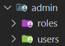
It's also possible to clone existing folder icons and change their colors to create new icons that can be associated with folder names. The following example shows how to clone the `admin` folder icon:
```json
"material-icon-theme.folders.customClones": [
{
"name": "users-admin",
"base": "admin",
"color": "light-green-500",
"lightColor": "light-green-700",
"folderNames": ["users"],
"rootFolderNames": ["users"]
},
{
"name": "roles-admin",
"base": "admin",
"color": "purple-400",
"folderNames": ["roles"],
"rootFolderNames": ["users"]
}
]
```
This will create two new icons called `users-admin` and `roles-admin` that are associated with the folder names `users` and `roles` respectively. The `base` property defines the icon that should be cloned (in this case the `admin` folder icon). The `color` property defines the color of the new icon. The `lightColor` property is optional and defines the color of the icon when Visual Studio Code is running with a light color theme. The `folderNames` property defines the folder names that should be associated with the new icon. The `rootFolderNames` property defines the root folder names that should be associated with the new icon.
- Although you can use any `#RRGGBB` color for the `color` and `lightColor` properties, if you want to stick with colors from the material palette, you can check the full list of allowed aliases in the [materialPalette.ts](https://github.com/material-extensions/vscode-material-icon-theme/blob/main/src/core/generator/clones/utils/color/materialPalette.ts).
- You can check the full list of available icons to be used as the `base` in the [folderIcons.ts](https://github.com/material-extensions/vscode-material-icon-theme/blob/main/src/core/icons/folderIcons.ts).
#### Root folder associations
You can customize the icon for your workspace's root folder. This is helpful if you want a distinct icon for the main folder in your project.
To assign an icon (e.g. the server folder icon) to a root folder (e.g., `backend`), use the following configuration:
```json
"material-icon-theme.rootFolders.associations": {
"backend": "server"
}
```
#### Customize root folder icon color
To change the color of root folder icons, add this setting:
```json
"material-icon-theme.rootFolders.color": "#F4511E"
```
#### Language associations
With the following configuration you can customize the language icons. It is also possible to overwrite existing associations.
```json
"material-icon-theme.languages.associations": {
"languageId": "iconName",
"json": "json"
}
```
You can see the available icon names in the overview above. See "[Known language identifiers](https://code.visualstudio.com/docs/languages/identifiers#_known-language-identifiers)" in the VS Code documentation for a list of permitted values for `languageId`.
#### Custom language icon clones
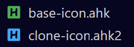
It's also possible to clone existing language icons and change their colors to create new icons that can be associated with language ids. The following example shows how to clone the `autohotkey` language icon:
```json
"material-icon-theme.languages.customClones": [
{
"name": "ahk-clone",
"base": "autohotkey",
"color": "blue-400",
"lightColor": "grey-600",
"ids": ["ahk2"]
}
]
```
This will create a new icon called `ahk-clone` which is associated with the language id `ahk2` respectively. The `base` property defines the icon that should be cloned (in this case the `autohotkey` language icon). The `color` property defines the color of the new icon. The `lightColor` property is optional and defines the color of the icon when Visual Studio Code is running with a light color theme. The `ids` property defines the language ids that should be associated with the new icon.
- Although you can use any `#RRGGBB` color for the `color` and `lightColor` properties, if you want to stick with colors from the material palette, you can check the full list of allowed aliases in the [materialPalette.ts](https://github.com/material-extensions/vscode-material-icon-theme/blob/main/src/core/generator/clones/utils/color/materialPalette.ts).
- You can check the full list of available icons to be used as the `base` in the [fileIcons.ts](https://github.com/material-extensions/vscode-material-icon-theme/blob/main/src/core/icons/fileIcons.ts).
## Commands
Press `Ctrl-Shift-P` to open the command palette and type `Material Icons`.
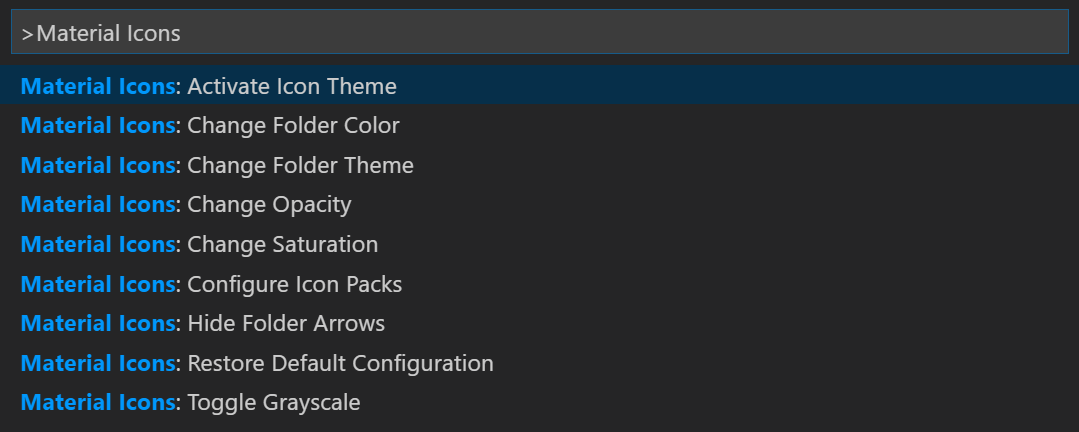
### Command List
| Command | Description |
|------------------------------------|-------------------------------------------------------------------------------------|
| **Activate Icon Theme** | Activate the icon theme. |
| **Change File Color** | Change the color of the file icons. |
| **Change Folder Color** | Change the color of the folder icons. |
| **Change Folder Theme** | Change the design of the folder icons. |
| **Change Opacity** | Change the opacity of the icons. |
| **Change Root Folder Color** | Change the color of the root folder icons. |
| **Change Saturation** | Change the saturation value of the icons. |
| **Configure Icon Packs** | Selects an icon pack that enables additional icons (e.g. for Angular, React, Ngrx). |
| **Restore Default Configuration** | Reset to the default configuration. |
| **Toggle Explorer Arrows** | Show or hide the arrows next to the folder icons. |
| **Toggle Grayscale** | Set icon saturation to `0` (grayscale), or `1` (color). |
## Icon sources
- [Material Design Icons](https://pictogrammers.com/library/mdi/)
- [Material Symbols](https://fonts.google.com/icons)
## Contributors
Thank you to all our amazing contributors!
Your support helps make Material Icon Theme better for everyone.
[](https://github.com/material-extensions/vscode-material-icon-theme/graphs/contributors)
## Contributing
We welcome contributions of all kinds! Whether you want to add new icons, improve documentation, fix bugs, or help with translations, your input is appreciated.
**How to get involved:**
- 📖 **Read the [Contribution Guidelines](https://github.com/material-extensions/vscode-material-icon-theme/blob/main/CONTRIBUTING.md)**
Learn about our coding standards, icon design tips, and workflow.
- 🐛 **Report Issues**
Found a bug or have an icon request? [Open an issue](https://github.com/material-extensions/vscode-material-icon-theme/issues).
- 💡 **Submit Pull Requests**
Ready to contribute code or icons? [Create a pull request](https://github.com/material-extensions/vscode-material-icon-theme/pulls).
- 🌍 **Help with Translations**
Improve or add translations by editing the files in `src/core/i18n/translations/` and `package.nls.*.json`.
## Related extensions
- [Material Icons for GitHub](https://github.com/material-extensions/material-icons-browser-extension)
- [Material Product Icons](https://github.com/material-extensions/vscode-material-product-icons)
- [Material Icons NPM Package](https://www.npmjs.com/package/material-icon-theme)
<br />
---
<p align="center">
<a href="https://github.com/sponsors/material-extensions"><img src="https://img.shields.io/badge/Sponsor-GitHub-blue?logo=github-sponsors&style=for-the-badge&colorA=263238&colorB=EC407A" alt="Sponsor on GitHub"></a>
<a href="https://github.com/material-extensions/vscode-material-icon-theme"><img src="https://img.shields.io/github/stars/material-extensions/vscode-material-icon-theme?style=for-the-badge&label=Star%20on%20GitHub&colorA=263238&colorB=1976D2" alt="Star on GitHub"></a>
</p>
<p align="center">
<em>Enjoying Material Icon Theme? Support the project by starring it or becoming a sponsor!</em>
</p>
", Assign "at most 3 tags" to the expected json: {"id":"9517","tags":[]} "only from the tags list I provide: []" returns me the "expected json"